Module 9: Advanced Stylesheets
In the last section, we added Snowpack to our project and began using it as our development web server. In this section, we’re going to see how we can use Snowpack plugins to add new languages and features to our components.
For this exercise, we’ll use the completed code from the Snowpack section. If you need it, you can download the starting code from here:
Download the code: counter-with-snowpack.zip
Exercise: rebranding the counter
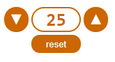
We’ve had a request from the marketing team – they think we’d sell more counters if our component was orange instead of blue. Apparently orange is extremely fashionable right now. They’ve sent us this mock-up:
Take a few minutes to modify your counter code so that it matches the mock-up.
You probably noticed that the blue colour on the original counter was repeated in several places. Wouldn’t it be nice if we could extract that into a variable, and then we’d only need to change it once?
Solution 1: CSS custom properties (aka “CSS variables”)
Custom properties, also known as CSS variables, became a W3C recommendation in 2015. They offer a way to define variables and perform calculations directly inside CSS. They’re a client-side technology, but they’re supported by all mainstream browsers.
CSS custom properties can store colours, font families, sizes, measurements – anywhere in CSS you would assign a value to a property, you can use a CSS custom property instead.
Here’s an example of a stylesheet that defines some custom properties:
:root {
    --code-text-color: lime;
    --code-background-color: black;
    --code-font-family: Consolas, courier, monospaced;
}

pre {
    color: var(--code-text-color);
    background-color: var(--code-background-color);
    font-family: var(--code-font-family);
}
ℹ CSS custom properties have to be declared within a scope, controlled by CSS selectors. The
:rootselector used here represents the root element of the document tree; it’s effectively a global namespace for declaring CSS variables.
Property values can be redefined within scopes; as with any other CSS property, more specific rules will override less specific rules.
Here’s an example of CSS custom properties being redefined by selectors:
p {
    color: var(--text-color);
    font-weight: var(--font-weight);
    font-family: var(--font-family);
}

article {
    --text-color: orangered;
    --font-weight: 400;
    --font-family: Times, Times New Roman, serif;
}

section {
    --text-color: purple;
    --font-weight: 700;
    --font-family: Brush Script MT, Brush Script Std;
}
section.highlighted {
    background-color: black;
    padding: 20px;
    --text-color: lime;
    --font-weight: 100;
    --font-family: Consolas, Courier New, monospaced;
}
You can see these rules in action:
View live demo: css-custom-properties-scopes.html
CSS Custom Properties and the Shadow DOM
A full discussion of CSS custom properties is beyond the scope of this workshop, but one detail of CSS custom properties that is particularly relevant to web components is that they are the only way that your hosting page can affect the style of elements within a web component.
To take advantage of this feature, you can use CSS custom properties when you declare the styles that are part of your component, whether they’re linked from an external stylesheet or defined inline.
You can also specify a default value, which will be used if the custom property hasn’t been defined. Here’s a custom component that references an external stylesheet:
class CssDemoElement extends HTMLElement {
    constructor() {
        super();
        this.closedRoot = this.attachShadow({ mode: 'closed' });
    }
    connectedCallback() {
        let link = document.createElement("link");
        link.setAttribute("rel", "stylesheet");
        link.setAttribute("href", "css-custom-properties-shadow-dom.css");
        this.closedRoot.appendChild(link);

        let p1 = document.createElement("p");
        p1.innerHTML = "This paragraph is part of a custom element.";
        this.closedRoot.appendChild(p1);

        let p2 = document.createElement("p");
        p2.innerHTML = "This paragraph is part of a custom element. <span>It contains a span</span>";
        this.closedRoot.appendChild(p2);
    }
}
customElements.define("css-demo", CssDemoElement);
Here’s the CSS code used by the component:
p {
    font-size: var(--font-size);
    color: var(--text-color, red);
}
p span {
    color: var(--span-color, var(--text-color, blue));
}
Even though the component uses a closed shadow DOM, we can affect the appearance of the elements inside the component by setting custom properties on the host page:
<style>
:root {
  --font-size: 16px;
  --text-color: green;
  --span-color: purple;
}
</style>
We can even use the tag name defined for our custom element as a CSS selector:
<style>
:root {
  --font-size: 16px;
  --text-color: green;
  --span-color: purple;
}
css-demo {
    --text-color: magenta;
    --span-color: lime;
}
</style>
View live demo: css-custom-properties-shadow-dom.html
CSS Custom Properties and JavaScript
One advantage of using CSS custom properties over a pre-processor is that you can manipulate your property values at runtime using JavaScript. If we define our CSS using custom properties:
:root {
    --foreground-color: hsl(100,50%,50%);
    --background-color: hsl(300,50%,50%);
}
html {
    color: var(--foreground-color);
    background-color: var(--background-color);
}
We can use JavaScript to change the property values, and any elements on the page which use those CSS variables will update to reflect the new values, as in this example which manipulates the page’s colour scheme based on mouse movements.
let root = document.documentElement;
root.addEventListener("mousemove", event => {
    let foregroundHue = event.clientX % 400;
    let lightness = (event.clientY/4) % 100;
    let backgroundHue = ((event.clientX/4) + 200) % 400;
    root.style.setProperty('--foreground-color', `hsl(${foregroundHue}, 100%, ${lightness}%`);
    root.style.setProperty('--background-color', `hsl(${backgroundHue}, 100%, ${lightness/2}%`);
});
View live demo: css-custom-properties-js.html
Solution 2: CSS pre-processors
CSS custom properties are great, but they’ve taken a long time to reach the point where they’re widely supported in mainstream browsers.
In the meantime, the frontend developer community has developed some excellent tools that allowed them to use more expressive languages when writing CSS while still targeting older and downlevel browsers, and my personal favourite of those is called SASS - Syntactically Awesome Style Sheets. It’s an extension language that compiles to CSS, so we can write our CSS rules using features like variables and mixins, and then convert this to regular CSS when we build our project.
SASS allows us to define variables, just as we can with CSS custom properties, but because SASS is an extension language that compiles to CSS, it also gives us a lot of extra features when it comes to structuring and maintaining our stylesheets – and then when it’s time to go live, our SASS files compile down to regular CSS, so we don’t rely on browser support for any special features.
Adding SASS to our solution
We’ve already installed Snowpack, so we’re going to use Snowpack’s plugin system to add support for SASS to our project.
First, we need to install the SASS plugin for Snowpack:
yarn add --dev @snowpack/plugin-sass
Then we need to update snowpack.config.js so Snowpack knows about our new plugin - add '@snowpack/plugin-sass' to the plugins collection:
module.exports = {
  mount: {
    /* ... */
  },
  plugins: [
    // Add this line to enable the SASS plugin
    '@snowpack/plugin-sass'
  ],
  packageOptions: {
    /* ... */
  },
  devOptions: {
    /* ... */
  },
  buildOptions: {
    /* ... */
  },
};
Finally, let’s rename counter.css to counter.scss.
ℹ SASS files can be written using two different syntaxes. Files with a
.sassextension use a proprietary syntax based on the YAML markup language, and are not compatible with regular CSS files. Files with a.scssextension are a superset of regular CSS. Any valid CSS file is also a valid SCSS file, so you can get started with SCSS by renaming an existing CSS file and then starting to incorporate SCSS features. Converting from CSS to SASS requires you to rewrite the file to use SASS syntax.
You’ll notice that not only has Snowpack automatically refreshed our page – but it all still works, even though the file counter.css doesn’t exist any more! This is because when Snowpack receives a request for counter.css, it checks to see whether counter.scss exists, and if it does, it will compile our .scss file to regular .css and serve that back to our browser.
Now that we’ve enabled the sass plugin, we can start modifying our stylesheets to take advantage of SCSS.
We can introduce a variable at the top of the file that controls our ‘brand color’:
$brand-color: #c60;
and then refer to this variable instead of the color wherever it’s used in our styles:
div.counter {
    text-align: center;
    border: 2px solid $brand-color;
}
button {
    font-weight: bold;
    font-size: 120%;
    border: 0;
    background-color: $brand-color;
    color: #fff;
}
We can also take advantage of SCSS support for nested selectors - instead of writing separate rules like this:
div.counter-wrapper {
    display: inline-grid;
    grid-template-columns: 32px 64px 32px;
    grid-template-rows: 32px 24px;
    justify-items: stretch;
    align-items: stretch;
    grid-gap: 4px;
}

div.counter-wrapper span {
    font-family: Consolas;
    font-weight: bold;
    color: $brand-color;
    font-size: 150%;
}
we can nest the span rule inside the div.counter-wrapper rule:
div.counter-wrapper {
    display: inline-grid;
    grid-template-columns: 32px 64px 32px;
    grid-template-rows: 32px 24px;
    justify-items: stretch;
    align-items: stretch;
    grid-gap: 4px;
    span {
        font-family: Consolas;
        font-weight: bold;
        color: $brand-color;
        font-size: 150%;
    }
}
Deploying to production with Snowpack
Running Snowpack as a development server means all our SCSS is automatically converted to regular CSS – but what happens when we want to deploy our code to production?
The answer is snowpack build. To build a deployable version of our project, type:
yarn snowpack build
This will run the sass plugin (and any other plugins and build steps from your snowpack.config.js file), and place the results in a folder called build. You can now copy the contents of the build folder to your server, or deploy them to a hosting platform such as GitHub Pages or an Amazon S3 public bucket.
ℹ Take a look at the
counter.cssfile in thebuilddirectory to see the CSS rules that are generated by thesassplugin based on our.scssfile.
Exercise: cleaner stylesheets with SCSS
In this exercise, we’re going to restructure our CSS by using nested SCSS selectors.
Here’s the structure of the final SCSS file; it’s up to you to work out which rules need to go where.
$brand-color: #c60;

div.counter-wrapper {
    //TODO: what goes here?

	span {
        //TODO: what goes here?
    }

    > * {
	    //TODO: what goes here?
    }
}

div.counter {
    //TODO: what goes here?
}

button {
    //TODO: what goes here?
    &#reset-button {
	    //TODO: what goes here?
    }
}
Custom Properties vs CSS pre-processors
We’ve seen two different approaches here for managing our stylesheets - but which is better?
Well, it turns out the answer is probably… both. 😉
Custom properties don’t require any additional tooling – if you don’t want to (or can’t!) install tools like Snowpack, you can write CSS that uses custom properties using any text editor, deploy it directly to your server without any additional tooling or build steps. They don’t work in Internet Explorer, but they’re well-supported in almost every other browser.
Custom properties also provide one important advantage over pre-processors, because you can use JavaScript to manipulate your variables at runtime.
pre-processors, on the other hand, provide a lot more than just variables. A full exploration of the capabilities of SASS and SCSS is outside the scope of this workshop, but you can use SASS features like mix-ins to build responsive layouts based on CSS media queries, break your CSS into modules, create your own functions, and much more.
Advanced Stylesheets: Review and Recap
- We can use two different technologies to create and manage the CSS files for our components
- CSS custom properties (aka CSS variables) are a browser technology introduced in 2015
- Custom properties allow us to define variables, manage the scope of those variables.
- Custom properties can be changed at runtime using JavaScript code
- CSS pre-processors are tools we use during development to translate other languages into CSS
- SCSS is a CSS extension language that extends normal CSS with support for variables, nested selectors, functions, mixins and modules
- SCSS can be written using “sassy CSS” syntax, an extension to regular CSS syntax, indicated by the
scssfile extension - SCSS can also be written using a YAML-based syntax which is not compatible with CSS, indicated by the
sassfile extension
Links and References
- Using CSS custom properties at MDN
- It’s Time To Start Using CSS Custom Properties at Smashing Magazine
- Patterns for Practical CSS Custom Properties by Tyler Childs at css-tricks.com
- CSS Custom Properties: W3C Candidate Recommendation at w3.org - the official W3C spec covering custom properties
- sass-lang.com - the home of syntactically awesome stylesheets
- github.com/sass – the SASS core specification and implementations on GitHub