Module 2: The Shadow DOM
In Module 1, we looked at how we can use the custom elements API to create our own HTML tags. One of the biggest challenges around creating and managing reusable components in a web application is isolating your component’s appearance and behaviour from the rules defined by the page where your component is hosted.
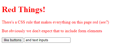
When we use built-in browser components like buttons and form elements, we take this behaviour for granted. You can see an example in red-buttons.html - this page contains CSS rule that changes all the text on a page to be bright red, but this doesn’t affect any of the form elements used on the page:
Now, let’s look at an example using custom elements. Here, we’re defining a custom HTML element in movie-list.js that renders a list of movies:
// movie-list.js
class MovieListElement extends HTMLElement {
  constructor() {
    super();
  }
  connectedCallback() {
    this.innerHTML = `
      <ul>
      <li>Alien</li>
      <li>Back to the Future</li>
      <li>Dirty Dancing</li>
      <li>Jumanji</li>
      <li>Zoolander</li>
      </ul>`;
  }
}

customElements.define('movie-list', MovieListElement);
We can import this component and use it in our page like this (examples/shadow-dom/movie-list.html)
<!DOCTYPE html>
<html>
<head>
    <meta charset="UTF-8">
    <title>Movie List Example</title>
    <style>
        li { color: #f0f; font-family: "Comic Sans MS" }
    </style>
    <script defer src="movie-list.js"></script>
</head>
<body>
    <movie-list></movie-list>
</body>
</html>
In this example, our page has a CSS rule that list items should be hot pink Comic Sans. That’s not what we had in mind when we designed our component. And, if the page developer uses a query like document.querySelector("li"), they’re going to find all of the <li> elements in our component – which probably isn’t what they want. Historically, if we wanted to render some content on a web page that was safely isolated from the rest of the page, we had to use an IFRAME element to do it – but iframes have all sorts of problems with performance, accessibility and security. What we really want is a way to create components that hook into the document object model (DOM) of the page where they’re being used, but which are safely insulated from things like CSS rules and JavaScript that are used on that page.
Time to meet the second of the core technologies behind web components - the shadow DOM. The shadow DOM provides a way to render HTML elements and styles – and capture events and interaction – while keeping our components safely isolated from the pages that host them.
Here’s an example of a component using the shadow DOM (movie-list-shadow-dom.js)
class MovieListElement extends HTMLElement {
    constructor() {
        super();
        this.attachShadow({mode: 'open'});
    }

    connectedCallback() {
        this.shadowRoot.innerHTML = `
        <ul>
            <li>Alien</li>
            <li>Back to the Future</li>
            <li>Dirty Dancing</li>
            <li>Jumanji</li>
            <li>Zoolander</li>
        </ul>`;
    }
}
customElements.define('movie-list', MovieListElement);
and here’s the HTML page that uses our component, movie-list-shadow-dom.html:
<!DOCTYPE html>
<html>
<head>
<meta charset="UTF-8">
<title>Customized Built-in Elements</title>
<style>
li { color: #f0f; font-family: "Comic Sans MS" }
</style>
<script src="movie-list-shadow-dom.js" defer></script>
</head>
<body>
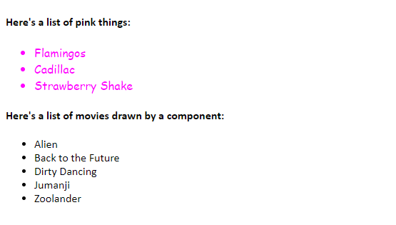
<h4>Here's a list of pink things:</h4>
<ul>
<li>Flamingos</li>
<li>Cadillac</li>
<li>Strawberry Shake</li>
</ul>
<h4>Here's a list of movies drawn by a component:</h4>
<movie-list></movie-list>
</body>
</html>
If you open this page in a browser, you’ll see that the page’s CSS rules affect the list that’s part of the HTML page, but they don’t affect the list that’s part of our component:
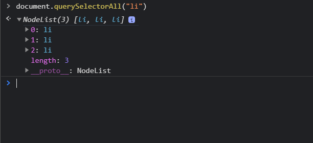
and if we use document.querySelectorAll("li") to find all the <li> elements in the page, it’ll find the three list items that are in the page markup, but won’t find any of the list items inside our component:
The code that makes this happen is in the constructor method of our component; immediately after calling the base class constructor with super(), we’re calling this.attachShadow().
constructor() {
    super();
    this.attachShadow({mode: 'open'});
    // we can now use this.shadowRoot() to manipulate the shadow DOM
}
The Shadow DOM: Open vs Closed Mode
When we attach a shadow DOM in our component, we have to specify whether we’re attaching it in open mode:
this.attachShadow({mode: 'open'});
// this.shadowRoot() is now a reference to the shadow DOM root.
or in closed mode:
var shadow = this.attachShadow({mode: 'closed'});
// Note that this.shadowRoot will always return null if we attach in closed mode.
// We need to assign the shadow root to a variable when we attach it.
The idea behind attachment modes was to allow component authors to control how much access the host page has to the internals of their components.
Take a look at open-vs-closed-example.html:
<!DOCTYPE html>

<head>
    <title>Open Shadow DOM Example</title>
</head>

<body>
    <p>
        <open-element id="my-open-element"></open-element>
    </p>
    <p>
        <closed-element id="my-closed-element"></closed-element>
    </p>
    <p><input type="button" onclick="hackAllTheThings()" value="Hack All The Things!" /></p>
    <script>
        function hackAllTheThings() {
            hack('my-open-element');
            hack('my-closed-element');
        }

        function hack(elementId) {
            let element = document.getElementById(elementId);
            element.shadowRoot.innerHTML = "YOUR SITE IS HACKED! HA! HA! 👿";
        }

        class OpenElement extends HTMLElement {
            constructor() {
                super();
                let shadow = this.attachShadow({ mode: 'open' });
                shadow.innerHTML = "My Shadow DOM is open!";
            }
        }

        class ClosedElement extends HTMLElement {
            constructor() {
                super();
                let shadow = this.attachShadow({ mode: 'closed' });
                shadow.innerHTML = "My Shadow DOM is closed!";
            }
        }
        customElements.define('open-element', OpenElement);
        customElements.define('closed-element', ClosedElement);
    </script>
</body>
</html>
If a component’s shadow DOM is open, any JavaScript on the hosting page can call component.shadowRoot and manipulate the shadow DOM directly. If the shadow DOM is closed, then component.shadowRoot will return null and so, in theory, the host page can’t modify the shadow DOM from outside. However, it turns out it’s actually very easy to bypass this ‘security’; as this article by Leon Revill puts it:
The
closedmode of Shadow DOM has a single benefit which is to provide component authors with control over how the Shadow Root of their component is exposed (if at all) to the outside world.Given that it’s incredibly easy to work around paranoid component authors hiding their Shadow Roots its probably not worth the effort.
The Shadow DOM: Review
- The Shadow DOM is a browser technology that allows us to isolate our component from the page that’s hosting it
- To use the shadow DOM, you need to call
this.attachShadowin your component’sconstructormethod. - The shadow DOM can be attached in
openorclosedmode. - Closed mode was designed to provide additional security and isolation, but normally isn’t worth it.
Exercise: Using the Shadow DOM
Have a look in the file keypad.html. You’ll find a page that uses a custom element to draw a numeric keypad:
<!DOCTYPE html>
<html>

<head>
    <title>Shadow DOM Exercise</title>
    <style>
        button {
            background-color: #f0f;
            font-family: Comic Sans MS;
            font-size: 180%;
            border-radius: 20px;
            outline: none;
            border-style: 5px solid #f0f;
        }
    </style>
    <script>
        class NumericKeypadElement extends HTMLElement {
            constructor() {
                super();
            }

            connectedCallback() {
                let style = document.createElement('style');
                style.innerHTML = 'div.keypad div button { width: 2em; }';
                this.appendChild(style);
                let div = document.createElement('div');
                div.className = "keypad";
                div.innerHTML = `
                <div><button>7</button><button>8</button><button>9</button></div>
                <div><button>4</button><button>5</button><button>6</button></div>
                <div><button>1</button><button>2</button><button>3</button></div>
                <div><button>*</button><button>0</button><button>#</button></div>`;
                this.appendChild(div);
            }
        }
        customElements.define("numeric-keypad", NumericKeypadElement);
    </script>
</head>
<body>
    <p>This page has a keypad in it, drawn using a custom component:</p>
    <numeric-keypad></numeric-keypad>
    <hr />
    <p>The keypad is supposed to look like this:</p>
    <img src="keypad.png" />
    <p>The problems is, we asked our web designer to redesign some buttons, and ended up with all our buttons looking like this:</p>
    <button>Add to Cart</button>
    <button>Go to Checkout</button>
    <button>Help</button>
    <h4>Exercise</h4>
    <p>Use the Shadow DOM to fix the rendering on the keypad,
        without undoing any of our designer's
        brilliant work.
    </p>
</body>
</html>
The page uses a global CSS rule that makes all the buttons hot pink with oversize Comic Sans text.
Take a copy of this page, and modify this component so that it renders the control using the shadow DOM, so that the button styles don’t interfere with the rendering of the keypad.
Resources and Further Reading
- The Shadow DOM spec at the W3 Consortium: https://www.w3.org/TR/shadow-dom/
- Using Shadow DOM at MDN
- Open vs Closed Shadow DOM by Leon Revill
- Shadow DOM (V1) at caniuse.com