Module 6: Styling Components
In the last part of the workshop, we looked at a simple app that showed you how to organise and structure the classes in your web component. You probably noticed that in the code for our renderer, we added a <link /> element that referenced a CSS file, counter.css. In this section, we’re going to look at how web components work with CSS, and see how we can use Syntactically Awesome Stylesheets (SASS) in your web components.
What does “cascading” mean, anyway?
The styles applied to an element on a web page come from two sources. First, there cascading rules from the parent element. If we have a rule that says body { color: red; }, then any elements within the document body, such as headings, paragraphs, and lists, will also be red.
That’s the fundamental principle behind the design of CSS: elements look the same as their parent elements unless we tell them not to. This is why they’re called cascading style sheets:
Second, there are rules applied via CSS selectors. If we have a set of CSS rules like this:
body { color: purple; }
p { color: green; }
p.warning { color: red; font-weight: bold; }
a { color: blue; }
and some markup like this:
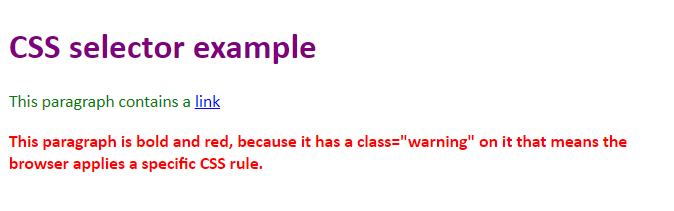
<body>
    <h1>
        CSS selector example
    </h1>
    <p>
        This paragraph contains a <a href="https://example.com/">link</a>
    </p>
    <p class="warning">
        This paragraph is bold and red, because it has a class="warning" on it that means the browser applies a specific CSS rule.
    </p>
</body>
here’s how the browser renders that page.
View live demo: css-basics.html
CSS and the shadow DOM
For components that use the shadow DOM, things are slightly different. Styles will cascade into elements that are contained within a component’s shadow DOM, but CSS selectors from the host page will not match elements inside a shadow DOM.
In other words… if you a rule that says everything inside your page’s
bodyis red, then that includes anything inside custom components. But if you have a rule that says “find all the paragraphs and make them green”, that rule won’t find any paragraphs that are contained inside a component’s shadow DOM, and so the green colour won’t be applied to those paragraphs.
View live demo: css-shadow-dom.html
Applying styles inside a web component
If you’re using the shadow DOM, you have four options when it comes to styling your components.
Inline styles
When you create HTML elements and add them to your shadow DOM, you can add inline styles using the style attribute:
connectedCallback() {
    let span = document.createElement('span');
    span.setAttribute("style", "color: red; border: 1px solid red;");
    span.innerHTML = "Look! I'm super stylish!";
    this.shadowRoot.appendChild(span);
}
👍 Simple way to add styles to a component
👍 Doesn’t require the browser to make any additional network requests
👎 Difficult to manage on even relatively small component projects
👎 No editor support for CSS (because it’s hidden inside a JavaScript string)
I often use this pattern when I’m debugging or experimenting, but I would never use it in production code; it’s unwieldly, difficult to maintain and doesn’t really provide any advantages beyond being very quick to implement.
Applying styles via JavaScript
Almost every CSS rule and property has a corresponding JavaScript property exposed via the DOM, so as an alternative to adding inline styles, you could use JavaScript to manipulate the CSS properties of your elements directly:
connectedCallback() {
    let span = document.createElement('span');
    span.style.color = "red";
    span.style.borderColor = "red";
    span.style.borderStyle = "solid";
    span.style.borderWidth = "1px";
    span.innerHTML = "Look! I'm super stylish!";
    this.shadowRoot.appendChild(span);
}
👍 Works really well for animation and interaction design
👍 Doesn’t require the browser to make any additional network requests
👎 Difficult to manage on even relatively small component projects
👎 No editor support for CSS (because it’s hidden inside a JavaScript string)
I’ve often used this pattern when I’m developing event handlers, to change a background color or add a border when the user interacts with part of a component, but once I’ve figured out how it should work I’ll normally move the code into an external stylesheet and use JavaScript to add and remove a className from the element, instead of manipulating the CSS attributes directly.
Adding a style tag to your components
Rather than styling individual elements, you can create a style tag within your component and use this to manage your CSS rules:
connectedCallback() {
    let style = document.createElement('style');
    style.innerHTML = `
span {
   color: red;
    border: 1px solid red;
}`;
	this.shadowRoot.appendChild(style);
	span.innerHTML = "Look! I'm super stylish!";
    this.shadowRoot.appendChild(span);
}
connectedCallback() {
    let span = document.createElement('span');
    span.setAttribute("style", "color: red; border: 1px solid red;");
    span.innerHTML = "Look! I'm super stylish!";
    this.shadowRoot.appendChild(span);
}
👍 Cleaner than applying inline styles or using JavaScript attributes.
👍 Doesn’t require the browser to make any additional network requests
👎 Difficult to manage on even relatively small component projects
👎 No editor support for CSS (because it’s hidden inside a JavaScript string)
I very rarely use this approach at all, except when writing workshop examples. 😉 It’s almost always quicker and easier to write your CSS rules in an external stylesheet and then use a link tag to include them instead of embedding them via a style element.
Linking to an external stylesheet
Finally, you can include a link element in your custom component, and reference an external stylesheet:
connectedCallback() {
    let link = document.createElement('link');
    link.setAttribute("rel", "stylesheet");
    link.setAttribute("href", "styles.css");
	this.shadowRoot.appendChild(link);

	span.innerHTML = "Look! I'm super stylish!";
    this.shadowRoot.appendChild(span);
}
👍 The best way to manage CSS for web components
👍 Editor support for CSS, including code completion and syntax highlighting
👎 Requires an extra network request
👎 Means your component has to ship at least two files - one .js and one .css 1
This is by far my preferred way to manage CSS for a production component – your CSS stays in a .css file, which enables things like syntax highlighting and code completion in editors, and as we’ll see in the next section, it’s the first step towards a much more powerful way to manage the CSS and other resources included in your web component projects.
Styling Components: Review & Recap
- You can style web components using regular CSS, just like any other elements on a web page
- CSS selectors from the host page will not match elements defined inside a shadow DOM
- Components can define their own styles, or they can reference styles from a separate stylesheet.
- There are several patterns you can use to apply styles in a component - inline styles, CSS via JavaScript, embedded a
styleelement, or using alinkelement to import an external stylesheet. - For most production applications, you should use a
linkelement to import styles from an external stylesheet. - For animation and interaction, use JavaScript to add and remove CSS classes instead of manipulating CSS properties on your elements directly.
Links and References
- CSS Properties Reference at MDN - includes the CSS and JavaScript names of most popular CSS properties
-
You can work around this by inlining CSS as part of your build process - we’ll talk about this later in the course. ↩